
Sensor dashboard
The sensor dashboard lets you view and download observation data from the onboard Triton sensors.
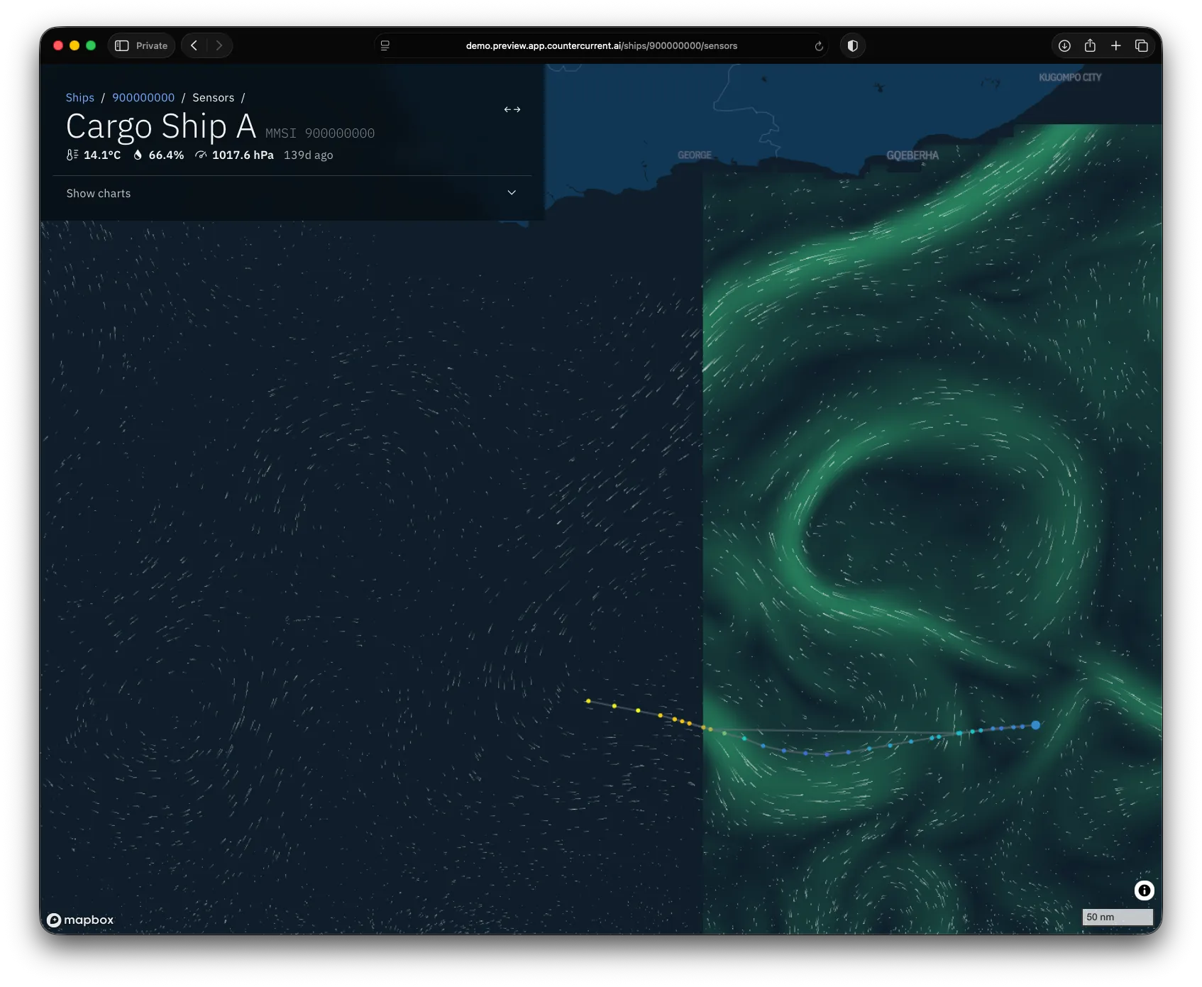
When you open the page, you may see:
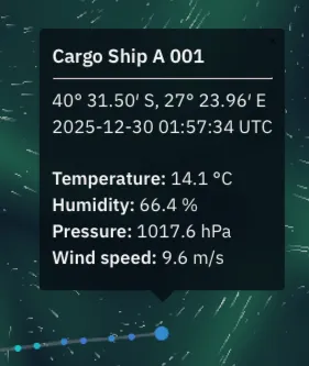
- The track of your most recent sensor observations as a solid grey line with coloured points. Click on the points to see the conditions recorded. The most recent observation appears as a larger circle. The popup includes sensor name, location, observation time, temperature, humidity, pressure and wind speed.
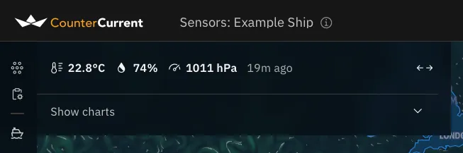
- The panel in the top-left shows the most recent temperature, humidity and air pressure observations straight away.
- If you’ve uploaded a voyage plan, you may see it as a dotted grey line with grey triangles ▲ for waypoints.
Your ship’s name is shown at the top of the screen in the title bar. The information icon next to it shows the ship’s MMSI.
Click or tap on the sensor points to see a popup with reported conditions:
The panel in the top-left reports the most recent conditions at a glance:
Map layers
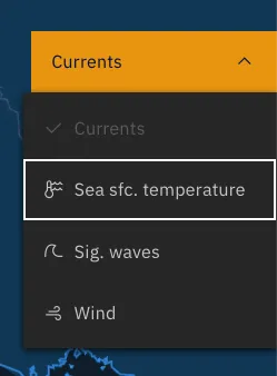
Section titled “Map layers”As on the forecast map, you can overlay environmental conditions using the layer button on the right-hand edge of the screen. The button shows an icon for the layer currently displayed:
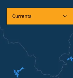
Tap it to switch between currents, sea surface temperature, significant wave height, and wind. Hover or tap the map to see values and direction.
Tap Show charts to expand this into a full sidebar, showing sensor data in chart or table form:
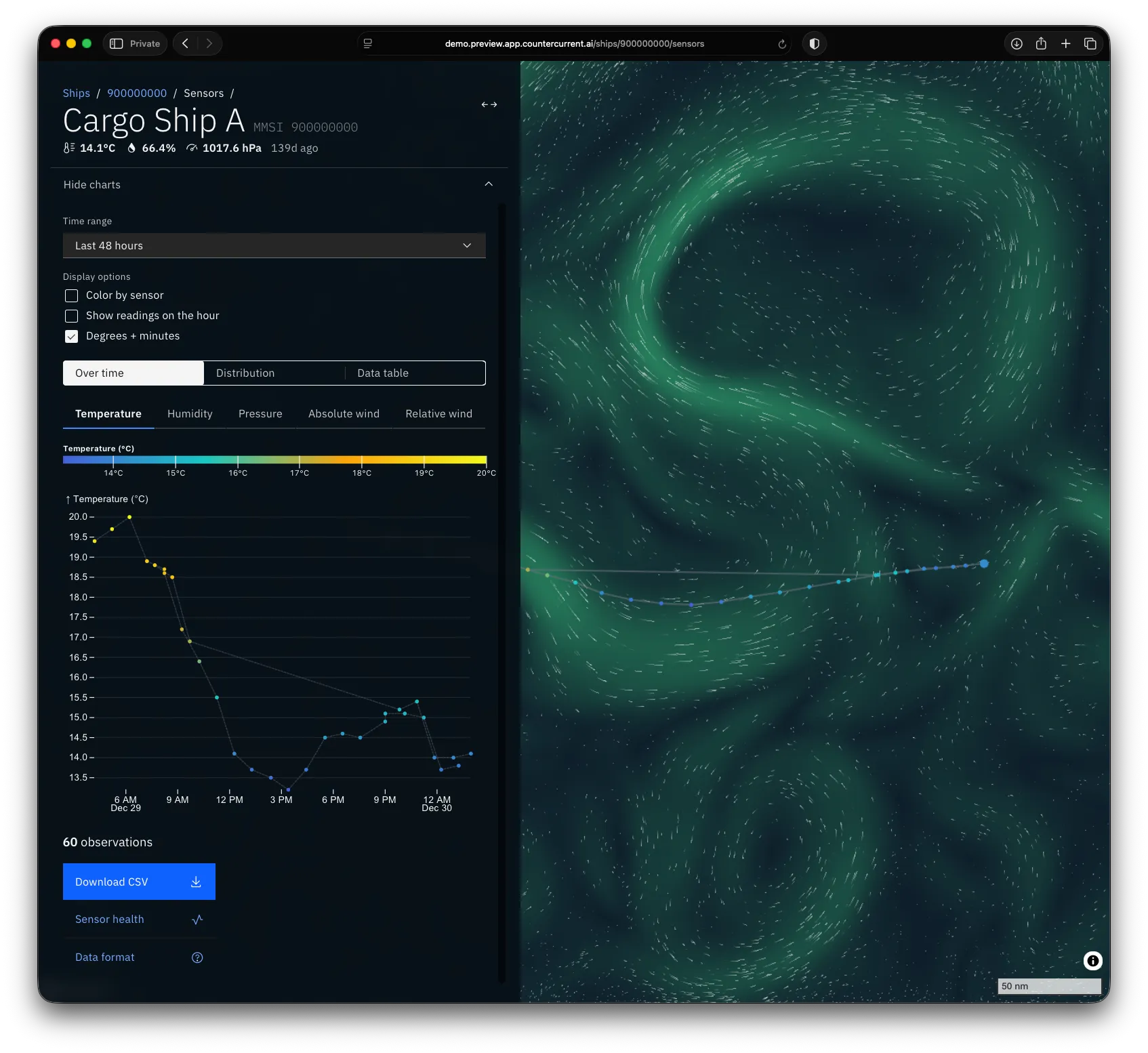
Going from top to bottom, you can change a number of options:
Time range
Section titled “Time range”Choose a preset time range or choose Custom to fill in the exact time range you want to view.
View options
Section titled “View options”- Whether to colour points according to which sensor recorded them. This can be a useful diagnostic when sensors disagree.
- Whether to estimate observations each hour, which may be useful for reporting purposes.
- Whether to use degrees and minutes for location, instead of decimal degrees.
Chart types
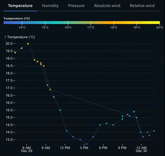
Section titled “Chart types”Change over time
Section titled “Change over time”This shows a chart of sensor readings over time. Each sensor’s observations are connected by a grey line, as on the map. Select the Color by sensor option to replace the metric-based colors with colors for each sensor.
Distribution
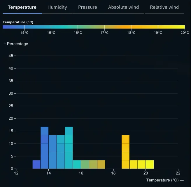
Section titled “Distribution”For temperature, humidity and pressure, you will see a histogram, showing the proportion of sensor data at selected ranges:
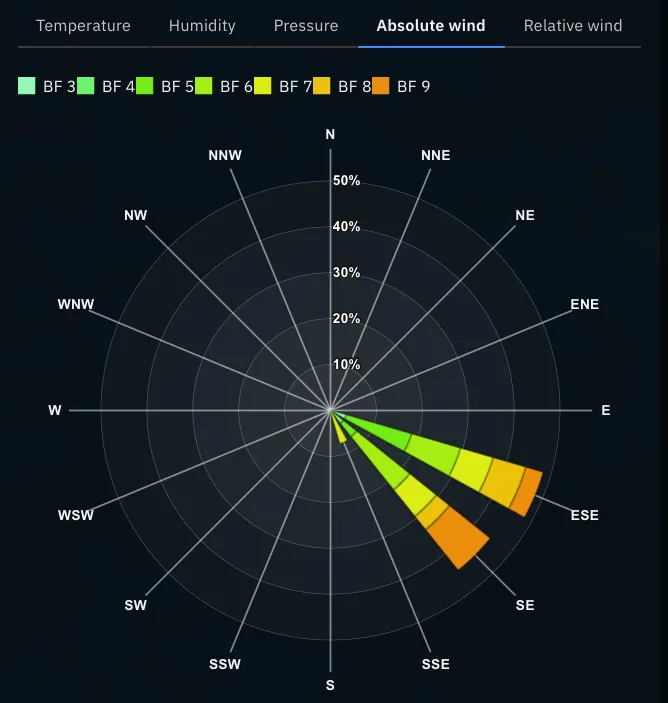
For absolute and relative wind, you will see a wind rose — a stacked bar chart arranged radially. Each part of the bar represents a wind speed range; the length represents the proportion of data in this speed and direction range. The direction represents where the wind is coming from, not where it is going to.
Data table
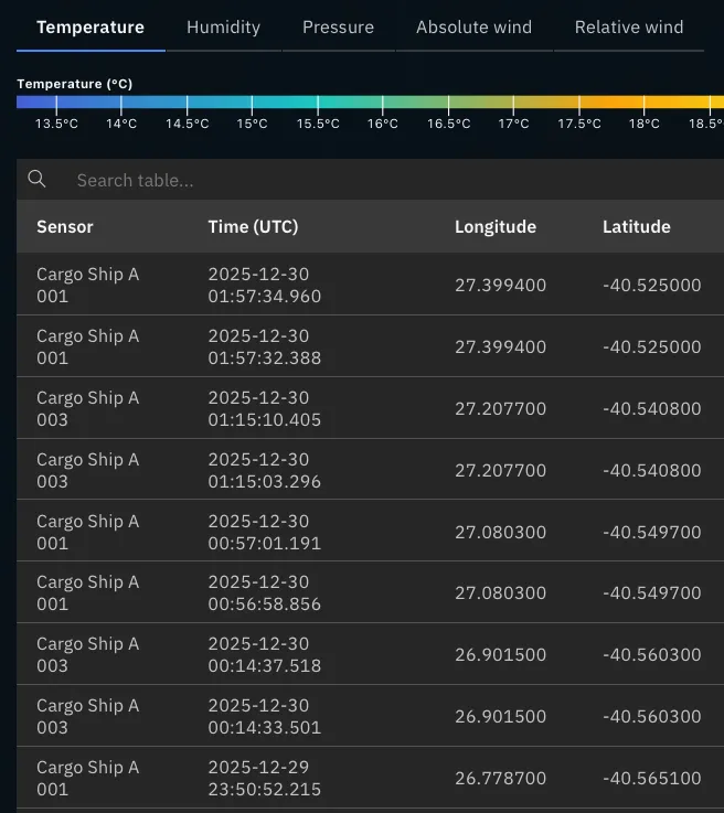
Section titled “Data table”You can also view individual data as a table:
If you need more space for the table or chart, use the expand button in the top-right of the sidebar to make it full screen:

Metric
Section titled “Metric”The sensor dashboard lets you select five metrics at present:
- Air temperature
- Relative humidity
- Air pressure
- Absolute wind — as measured from land, correcting for the motion and orientation of the ship. If the sensors are temporarily unable to report location, this measurement may also be missing.
- Relative wind — directly from the sensor — essentially as people on the ship experience it. Direction is relative to the bow of the ship.
Downloading data
Section titled “Downloading data”Below the chart or table itself, there is also a download button if you would like a spreadsheet of observations.